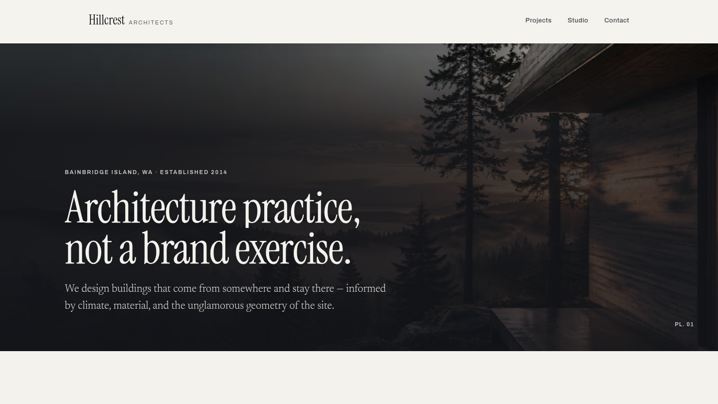
A fictional twelve-person architecture practice on Bainbridge Island — Hillcrest Architects — built to answer the one question a design-led portfolio actually asks of a CMS: can it serve photographs properly. Shipped in 2026 as a five-page firm site, then rebuilt later that year against a full design system, a bespoke image pipeline and six written case studies. Live at hillcrest.wp.philiprehberger.com.
The challenge
Architecture firms are told to go to Squarespace, Cargo or Framer, and for a ten-project studio that is often right. The argument gets weaker the moment the portfolio is forty projects deep, each with its own gallery, spec table and narrative that a practice manager needs to update without opening a design tool. What those platforms are genuinely good at is images — and that is exactly where WordPress is usually worst, because the default path hands you one format, one srcset, and a media library full of sub-sizes nobody asked for.
So this demo is not really about layout. It is about whether a WordPress site can put a photograph on screen as well as a purpose-built portfolio platform can: right crop, right format, right size for the device, arriving without a layout shift, and still legible when the photograph behind the type turns out to be a bright one.
The approach
The site implements the Hillcrest design system, whose model is the printed architectural monograph. Paper ground, one rationed weathering-steel accent, a high-contrast serif that only ever appears large, and photographs numbered as plates — PL. 04, a caption in italic, a hairline, and nothing else. A monograph is mostly margin, and margin is what makes a photograph read as a work rather than a thumbnail; where a band feels too empty here, it is deliberate.
Every image on the site is a Plate. There is no thumbnail, no avatar, no icon illustration and no second image component. A Plate is cropped to one of five aspect ratios and nothing else, carries a number and a describing caption, and is revealed by a clip-path wipe from its bottom edge upward while the image inside settles from scale(1.06). It never fades. That single effect is the whole visual identity of the site in motion.
Two themes ship, paper and plate, and photography is the one thing that does not change between them — which turns out to have a consequence. Type laid over a photograph cannot use the inverted ink token, because that token flips to near-black in the dark theme and the photograph underneath does not. Three colors in this system are deliberately theme-independent for exactly that reason.
What’s on the site
- Home. A full-bleed panorama plate that drifts and parallaxes, the practice statement on a measured wash, then the project index — six full-width rows alternating sides so the eye zig-zags — the inverted studio band with its staffing argument as a pull quote, and the contact panel
- /projects/. The same six rows at full width. Not a card grid: six projects in a grid look like a portfolio template, six projects as rows look like a body of work
- Six case studies at
/projects/<name>/. Opening plate, spec table, the site, the materials with an offset pair of plates, a pull quote, and the decisions we’d defend — four choices a client could argue with, each defended in three sentences. That last section is the reason the template exists - /studio/. Why the practice stayed at twelve people, the two principals who will actually be on your project, and the practice’s own facts in the same spec table the projects use
- /contact/. An address, an email and a phone number. No form: a practice that takes a handful of projects a year gets emailed by a person, it does not get a box filled in
The image pipeline
WordPress’s own path was not usable here, for two reasons. add_image_size() generates every registered size for every attachment, so declaring five plate ratios would cut each photograph five ways and discard four of them. And core has no <picture> output at all — one format, one srcset, take it or leave it.
So each plate carries its own ladder. A plate knows its ratio, its master is already cropped to it, and its derivatives are a pure downscale — six widths in AVIF, WebP and JPEG, recorded in attachment meta and deleted with the attachment. The page emits a <picture> with an AVIF source, a WebP source and a JPEG <img> fallback, each with a sizes string computed from the real column arithmetic rather than guessed, explicit dimensions on every image, lazy below the fold and a preload for whichever plate is the largest contentful paint on that page.
AVIF is the reason the host gained php8.3-imagick: WordPress had only GD, which could not encode it. Measured on that hardware against a 1200px crop, AVIF at quality 60 is 85.6 KB at SSIM 0.9691, WebP is 86.8 KB at 0.9584, and JPEG at 82 is 152.4 KB at 0.9719 — so AVIF beats WebP outright and costs 44% fewer bytes than JPEG for the same eye.
Two things nearly went wrong silently, and both are now comments in the code. WP_Image_Editor::save() re-derives the default quality whenever the output format differs from the source format, so a quality set beforehand is discarded — which is how an AVIF ladder ends up larger than the WebP one it exists to beat. And image_editor_output_format is keyed on the requested output format rather than the source, so the map this theme wants for its media-library thumbnails would have quietly rewritten every JPEG fallback into a WebP file with a .jpg name in its place. The JPEG tier of every <picture> would have ceased to exist, with no error anywhere.
The stack in detail
A per-demo theme (hillcrest) on the platform chassis, plus thirteen demo-local blocks. The design tokens live in one CSS file — color, type, space, radius, the five plate ratios and the motion scale — and theme.json declares its palette as var() references into that file rather than as hex, which is what makes every WordPress preset theme-aware without anyone doing anything.
Instrument Serif, Newsreader and Archivo are self-hosted as woff2 rather than pulled from Google Fonts at runtime. Newsreader’s optical-size axis is instanced at 16 rather than shipped as the full 6–72 range: every size this system sets it at falls between 13 and 21px, so the axis buys nothing and carrying it cost 113 KB across the roman and the italic.
A whole case study is one block and one project slug. The six projects and their prose live in a single PHP array, so writing the seventh means adding to that array and re-running the seed — no template, no block, no migration.
Where we made tradeoffs
Projects are hardcoded, not a custom post type. The obvious shape for this is a project CPT with an ACF field group mirroring the spec table. We chose the array instead, because this is a portfolio demo with a fixed body of work and a CPT would have added a plugin dependency and an admin screen nobody uses. The cost is stated rather than hidden: a new project is a code edit, not something a practice manager can do in wp-admin. On a real engagement that decision flips.
The pending state is used, not papered over. Five of the six projects have exactly one photograph. Their case studies show it as the opening plate and as one half of the offset pair, and render the interiors and details as the Plate pending state — a well at the correct ratio with its plate number and the words “Photography forthcoming”. No icon, no gray mountain, no stock photograph of somebody else’s building. The site already said this in words before the redesign; the design does not get to paper over it.
Two departures from the design system, both because the system contradicted itself. Its tokens route type over a photograph to the inverted ink color, which is correct in the light theme and near-black in the dark one; three colors are now deliberately theme-independent. And the wash under that type is specified at 46% and drawn in the reference page as a gradient reaching 72% — measured against the real composite, neither holds. The eyebrow over the homepage hero came out at 1.5:1 and the case-study headline at 3.9:1. The text box now carries a flat 80% wash that clears 4.5:1 for all three type colors against a pure white frame, with the softening fade moved above the text where no type sits.
The hero grows rather than clipping. The approved page fixes the hero at 21:9 with overflow: hidden and puts the firm’s name inside it; at 400px that box is 171px tall and the type needs about 250px, so the reference loses the first line of its own headline. A breakpoint only moves the failure, so the ratio became a floor instead of a fixed height — exactly 21:9 wherever a panorama fits, which is every desktop and tablet, and taller where it does not.
Outcomes
- 577 of 577 design-system checks pass against the live site — six pages at three widths in both themes, plus the plate pipeline in bytes, layout shift, reduced motion, JavaScript off, keyboard-only operation, the palette’s own contrast contract, and a structural diff against the approved reference pages. Committed as a harness, not a checklist
- Lighthouse accessibility, best practices and SEO 100 on all six pages; performance 93–100; cumulative layout shift 0
- Every palette pair meets its contrast target in both themes, and every line of type over a photograph clears 4.5:1 against the brightest pixel in its own bounding box — measured by redrawing the composite, not assumed from a token
- With JavaScript disabled and with reduced motion requested, both pages are complete and every plate is visible. The mask is only ever applied after a script adds a class, so the site never ships an image clipped to nothing
- The designer’s ten crops were recovered from downscaled derivatives by normalized cross-correlation against the full-resolution masters — all ten matched at 0.9995 or better — so the shipped images are the intended framing applied to the originals rather than a re-crop by eye
- Six case studies written, where the previous version had one and five rows saying “forthcoming”