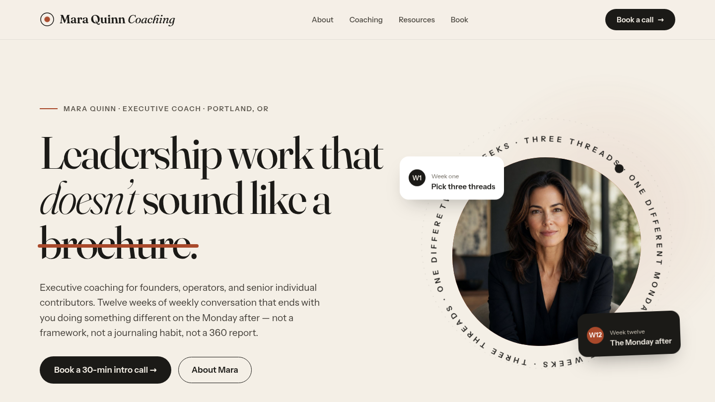
A fictional executive coaching personal-brand site — Mara Quinn Coaching — built to argue that WordPress is the right stack for the single-practitioner request that lives uncomfortably between Squarespace templates and bespoke Webflow builds. Twelfth demo on the platform, and the one that answers the follow-up question every personal-brand prospect asks: can it also look like the expensive thing? Rebuilt September 2026 around an animated editorial homepage. Live at coach.wp.philiprehberger.com.
The challenge
Coaches default to one of two failure modes online — the wellness-mystic template (“transform your leadership presence”) or the funnel-by-default landing page that gates pricing behind a “discovery call.” Both treat the prospective client as a lead to capture rather than a peer to talk with. The result reads as either spiritual marketing or sales-call bait; neither communicates what the work actually looks like or what a session would cost. The genre’s prevailing convention is that a coaching site’s job is conversion to an intro call; the prospective-client reality is they’re trying to figure out whether this specific coach is worth their forty minutes and $5,000.
The narrative confuses “coaching shopper looking for a methodology” with “operator looking for a specific person to think with for twelve weeks.” For the latter — which is most of the work an established coach actually wants — the right site looks more like a long-form personal essay than a sales funnel: who the coach is, what they did before coaching, who they work with and (importantly) who they don’t, what an engagement actually costs.
The original build made that argument in a plain editorial register and made it well. What it did not answer was the objection that follows it: that the honest, text-forward version is the cheap-looking version, and that a coach who wants presence has to leave WordPress for a bespoke build. The September 2026 rebuild exists to close that gap — same copy, same honesty, a homepage that moves.
The approach
A per-demo theme (coach) on the platform chassis, with no new shared block. The design language is warm editorial: paper (#F4EFE6) and ink (#1B1A17) with terracotta (#A9492B) as the single accent, plus sand, bone and a sage green that appears exactly once — as the third thread on the twelve-week chart. Fraunces carries every heading as a variable display serif with real italics; Instrument Sans carries the body.
Both faces are self-hosted as latin and latin-ext variable woff2, registered through theme.json so the editor renders what the front end will. The design as delivered linked Google Fonts, which costs two third-party origins — DNS and TLS to fonts.googleapis.com, then again to fonts.gstatic.com — before a single character can paint. Three files, 173 KB on a typical load, no third-party request.
The homepage is a motion piece. The headline arrives word by word and a terracotta rule strikes through the last word; the portrait sits in a morphing blob behind a counter-rotating ring of set type; a marquee band scrolls beneath it; three SVG threads draw themselves across twelve weeks and converge on “The Monday after”; a cinematic band drifts under a gradient; engagement cards zoom on hover beside small animated badges; four statistics count up; the testimonials swap on a tab list. Scroll reveals use animation-timeline: view() where it is supported and an IntersectionObserver everywhere else.
The whole of it degrades. With prefers-reduced-motion set, every animation is zeroed and nothing is left invisible. With scripting off, the headline is plain text, all three testimonials stack and read, and the four statistics are still the right numbers — because they are real text in the markup rather than CSS generated content.
Editable, not just animated
The point of building this in WordPress rather than as a static page is that Mara can still edit it. So the homepage is core blocks: every heading, paragraph, button and photograph is an ordinary editable block carrying a class name the theme styles. Only the decorative SVG furniture — the rotating ring, the thread chart, the card badges, the CTA ring, the marquee — is a Custom HTML block.
The homepage’s post_content holds 70 copy-bearing core blocks (13 headings, 44 paragraphs, 11 images, 2 buttons) against 19 Custom HTML blocks that contain no prose at all. The testimonials are the load-bearing case: the delivered design held the three quotes in a JavaScript array, which desynchronises the first time anyone edits one, so here they are three ordinary block groups that the theme’s script promotes into an ARIA tab widget at runtime — building the tab list out of their own names, roles and avatars.
What’s on the site
- Home. Sticky translucent header with a pulsing wordmark dot; the animated hero; the marquee band; the twelve-week thread chart; a full-width cinematic band (“No certifications I think mattered. Just the work.“); an arch-masked About block with a floating “2017” badge and fact pills; a dark engagements section with three photo cards and counting statistics (9 · 220+ · 38 · 30 min); two staggered resource guide cards; the testimonial tab list; and a terracotta CTA panel with a round “Book a 30-min call” button
- /about/. Long-form bio across four sections. Names the actual operator background, the explicit “no ICF credential, no Hogan certification” honesty, and a “who I refer out” paragraph that says no to early-career ICs, sales leaders, and people outside tech
- /coaching/. The three engagements as alternating photograph-and-copy rows, each with what the engagement actually looks like operationally and a flat-rate price in the open — $5,800 for the twelve-week 1:1 arc, $22,000 for the two-day leadership offsite, $6,500 for the career-transition quarter
- /resources/. Two lead-magnet PDF panels with descriptions, page counts and “Email me for the PDF” buttons, explicit “no list signup unless you opt in” copy, and a quarterly-essays callout
- /book/. Email-only contact card — no phone, no Calendly, no scheduling widget — with a “what the call is and is not” list that screens out sales-call-style entries
- Below 900px the navigation collapses into a right-hand drawer over a blurred backdrop: large serif links that animate in one after another, a portrait, and a booking button. It closes on the button, the backdrop, any link, Escape, or the window passing 900px again
The stack in detail
_chassisparent theme — templates, parts, patterns, gotcha-busting CSS, filemtime-based stylesheet enqueue. Inherited from the platform via symlinkcoachper-demo theme (this repo) —theme.jsoncarrying the palette and both self-hosted variable faces; a three-file cascade oftokens.css→motion.css→site.cssenqueued at priority 99 so the chassis keeps the last word;site.jsfor the headline split, the reveal fallback, the tab widget, the drawer and the count-up; and two PHP patterns for the header and footer chrome- No new shared block, a fifth time. The deferred
sfp-blocks/person-cardstays deferred: this demo’s “team” is one portrait and three testimonial avatars - Four
sfp-*mu-plugins inherited from the platform;coach-banner-config.phpfilters the demo banner copy - WordPress 7.1 · PHP 8.3 · MySQL 8 on Apache 2.4, on the shared EC2 host
.scripts/seed-pages.sh— idempotent five-page seed that prefers the delivered photograph renditions, imports them with the standard<name>-imageslug rename, and rewrites all five page bodies.scripts/verify-design.mjs(npm run verify) — 107 checks in a real browser: every page at 1440/820/390 for horizontal scroll, console errors, broken photographs and unrevealed content; the drawer’s full open/close/focus contract; the tab list’s keyboard behavior; reduced motion; scripting off; non-text contrast; and that the header still sticks
Where we made tradeoffs
Fixing the delivered design rather than porting it faithfully. Three things in the reference were wrong and were changed, each noted in the code. Its unselected testimonial tabs and hamburger button were bounded by lines at 1.44:1 and 1.53:1 against their grounds, under the 3:1 that WCAG 1.4.11 asks of a control boundary — and Lighthouse does not test 1.4.11, so the stated “accessibility at least 95” would have passed with it broken. Its four statistics were counter() generated content, invisible to screen readers and crawlers and rendering as 0 wherever @property is unsupported. Its tab list had click handlers and no keyboard support at all. Porting a design faithfully does not extend to porting its defects.
Animation that is never the only carrier. The temptation with a motion piece is to let the movement do the communicating — reveal on scroll, count up, and call the content delivered. Every moving thing here is decoration over content that is already correct when it does not move. That is why the statistics are text, why the headline ships unsplit, and why the testimonials are markup rather than a script’s data. It costs more code than the reference and it is the difference between a demo and something a client could run.
Clipping the drawer, not the page. The closed drawer is a fixed panel translated a full width past the right edge, and it put 340px of phantom scrollable width on every page. The obvious fix — overflow-x on the root — propagates to the viewport and takes the scrollport with it, which silently un-sticks the sticky header. The drawer and its backdrop live in one viewport-sized clip layer instead, and the verification harness now asserts the header is still stuck after scrolling 1600px, because that is exactly the kind of regression nobody notices by eye.
Flat-rate engagement pricing stays visible. Unchanged from the original build and still the right call. Some intro-call requests don’t happen because the prospective client self-disqualifies on price; the calls that do happen are with people who already know the engagement fits their budget and are now evaluating fit. For a single practitioner whose calendar is the constraint, that math is obvious.
Outcomes
- A five-page personal-brand site with an animated editorial homepage, live at coach.wp.philiprehberger.com, running on the same shared chassis as every other demo on this hub
- The homepage’s copy is 70 editable core blocks. Animation, a bespoke SVG chart and a custom tab widget did not cost the client the ability to edit their own words — which is the entire reason to build this in WordPress
- Three accessibility defects in the delivered design found and fixed before they shipped, including one that Lighthouse would never have reported
- A committed 75-check verification harness that covers the handoff’s definition of done and runs against the live site in one command
- Both typefaces self-hosted, removing two third-party origins from the critical path
- Fifth consecutive Tier 1 demo to ship without a new shared block