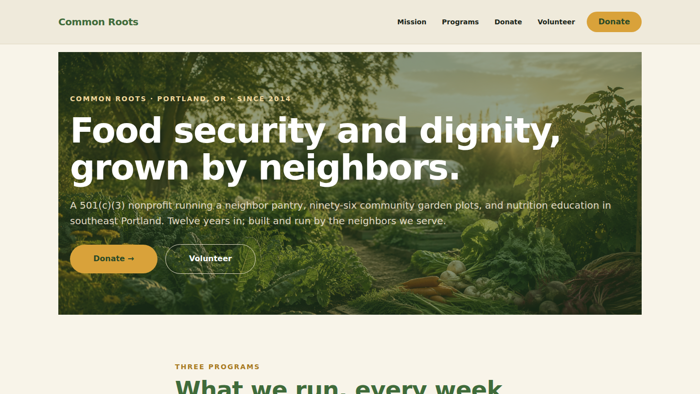
A fictional community garden and food-security nonprofit — Common Roots — built to argue that WordPress is the right stack for mission-driven sites that take their beneficiaries seriously and their donors literally. Thirteenth demo on the platform and the fifth and final demo of the Tier 1 batch. Live at give.wp.philiprehberger.com.
The challenge
Nonprofits default to sentimentality-and-stock-photos sites — beneficiary photos with names withheld, vague impact stats (“over 100,000 people served!”), opaque budgets, and a donate page with sliding pricing that hides what each gift actually buys. The genre treats donors as marks rather than peers and beneficiaries as need-statistics rather than neighbors. The result is sites that read identically across thousands of mission orgs and tell prospective donors nothing actionable about what the work actually looks like.
The narrative confuses “donor who wants to feel good” with “donor who wants to know what the money buys.” For the latter — which is most major individual donors and almost all institutional funders — the right site looks more like a credible operations report than a fundraising brochure: what each program runs on, who it serves, what a given gift actually covers, who’s on the board, where the org refers work it can’t take. Common Roots is the worked example.
The approach
A per-demo theme (give) on the platform chassis with no new shared block — fifth time this Tier 1 batch we’ve made that call. The theme owns its identity: forest moss primary (#3F6B3A), warm gold accent (#D9A23A), cream background (#F8F4E9), DM Sans throughout. The donate CTA in the header uses an inverted treatment — gold pill against moss primary, instead of the standard primary-on-base — because the donate CTA is the page’s primary affordance and needs to visually outrank the nav. First demo to use that inversion; pattern available to any future demo where a single CTA needs visual primacy over category navigation.
The pricing-honesty discipline that ran through all four prior Tier 1 demos closes here as budget transparency on the Programs page. The Neighbor pantry is named with its $78,000/year budget, the Community plots with $32,000/year, the Nutrition education with $24,000/year. The Donate page lists four giving tiers named after what they cover (“A bag of groceries” at $15/month, “A garden plot” at $40/month, “A cooking workshop” at $100/month, “A week of work” at $500/month), each with concrete per-tier impact. The “How to give” callout names every channel (online via GiveLively, check, stock + IRA distributions, employer match in Benevity / YourCause) and the EIN. The transparency completes the Tier 1 pricing-honesty arc across legal results, roofing cost ranges, dental procedure pricing, coaching engagement rates, and nonprofit program budgets — five for five.
What’s on the site
- Home. Moss cover hero with org name + tagline (“Food security and dignity, grown by neighbors.”), three program cards with cream-on-moss tile treatment, a
sfp-blocks/trust-stackimpact bar (12 years · 280,000+ meals · 96 garden plots · 18,000+ volunteer hours), and a “Saturday harvest” callout that treats the impact narrative as concrete operational detail (specific pounds harvested, specific volunteer count) rather than donor-bait - /mission/. Long-form mission across four H2 sections (How we started, Our theory of change, Who we serve, Staff & board) with the founder portrait + bio, the overhead garden shot, and an honest theory-of-change paragraph that names the three things food insecurity is downstream of (income gap, transportation gap, knowledge gap) and is explicit about which the org can address. Names every board member with role + neighborhood
- /programs/. Three alternating image-text rows for Neighbor pantry, Community plots, and Nutrition education. Each row carries a substantive operational description and a per-program budget paragraph in italics. The Neighbor pantry section explicitly names the choice-model design and the “no proof of need” policy as the dignity decision they are; the Community plots section explains the sliding-scale plot fees and the 35% voluntary donation back
- /donate/. Four giving-tier cards (\$15 / \$40 / \$100 / \$500 per month) named after what they cover with per-tier impact descriptions and notes about donor concentration (“Less than 5% of donors give at this tier; they cover 28% of pantry costs”). The “How to give” callout names every channel and the EIN. No payment integration on the demo (the real engagement would integrate with GiveLively or similar)
- /volunteer/. Five operationally specific regular shifts (Pantry Tue/Sat 3:30–7:30, Garden Saturdays 9–12, Pickup driver Mon/Fri 10–noon, Cooking workshop helper Wed 5:30–8, Office work 4 hrs/week flexible), two seasonal shifts, a three-step “how to start” process treating sign-up as a real conversation, and a group-volunteering callout that explicitly says “no posed photo ops”
- Demo banner across the top making it explicit that Common Roots is fictional
The stack in detail
_chassisparent theme — templates, parts, patterns, gotcha-busting CSS, filemtime-based stylesheet enqueue. Inherited from the platform via symlinkgiveper-demo theme (this repo) — declaresTemplate: _chassis, ships the moss + gold + creamtheme.json, DM Sans for both heading and body slots, customparts/header.htmlwith inverted gold “Donate” pill +parts/footer.htmlwith 501(c)(3) bio + EIN + nav + officesfp-blocks/trust-stackon the home page for the impact bar. No new block authored, deliberately- Four
sfp-*mu-plugins inherited from the platform;give-banner-config.phpfilters the demo banner copy for the nonprofit / mission-driven copy - WordPress 6.x · PHP 8.3 · MySQL 8 on Apache 2.4 (the same EC2 t3.small that hosts every other demo on the hub)
.scripts/seed-pages.sh— idempotent five-page seed. Generates a wide moss-cream hero, three program tiles, three impact-story photos, a volunteer-group shot, a founder portrait, and a garden-overhead shot via ImageMagick. Uploads viawp media importwith the standard<name>-imageattachment-slug rename; creates or refreshes all five pages; pins Home as the front- Standard repo additions:
needed-images.mdin the repo root specifying every image slot the demo expects (10 site content images with explicit consent guidance), and.scripts/capture-portfolio-screenshots.shexposed asnpm run capture:portfolio
Where we made tradeoffs
No new shared block, fifth time. The deferred person-card and before-after-slider close out the Tier 1 batch still on the queue. Across the five demos — lawyer roster, roofing before/after gallery, dental team, coach testimonial trio, nonprofit founder + board — we never found a “team card” shape consistent enough to abstract, nor a transformation-gallery shape distinct enough to warrant the slider interaction. The two blocks remain available as future work when a real client engagement names the schema; the Tier 1 verdict is that “use core composition + substantive domain content” is the platform’s default move for service-business demos. Both deferred blocks live in the gotchas of `add-new-demo.md` as documented deferrals.
Budget transparency on Programs. The donor-management-CRM default is to hide program-level budgets behind a “Sustainability” or “Financials” page that only shows the IRS 990 summary. We did the opposite: per-program operating budget in italics under each program description ($78,000 pantry, $32,000 garden, $24,000 education), with the explicit total program spend percentages. The cost of showing budgets is that some prospective donors compare your unit economics unfavourably to a peer org; the benefit is that the donors who give do so because they’ve understood what the gift covers. For a nonprofit whose constraint is donor concentration rather than donor volume, that math is obvious — same pattern as the coach demo’s engagement-pricing visibility.
Inverted-CTA pattern in the header. The standard treatment across the prior Tier 1 demos is a primary-colored pill on the base background (“Book a visit” on dental, “Book a call” on coach). Common Roots flips it — gold pill on moss header background — because the donate CTA is the page’s primary affordance, and the standard treatment would let it blend into the nav. The cost is one more design decision to defend; the benefit is donate gets the visual priority it needs. Pattern is available to any future demo where a single CTA needs to visually outrank category navigation (think a SaaS “Start free trial” or an event “Buy tickets” CTA).
Outcomes
- Five-page nonprofit site live at give.wp.philiprehberger.com, end-to-end provisioned via the platform’s
provision-demo.shscript - Lighthouse: 98 / 96 / 100 / 92 (perf / a11y / best-practices / SEO) with placeholder photography. Within a point of the platform ceiling without per-demo tuning
- Greenfield-to-live in approximately four hours including the per-demo theme, the full five-page seed with budget-transparent program content, the case-study writeup, the hub Project registration, and the portfolio surfacing — matches roofing / dental / coach
- Closes the Tier 1 batch: five demos shipped (lawfirm, roofing, dental, coach, give) in approximately twenty-two hours total. All five share the per-demo-theme + no-new-block pattern; all five share the pricing-honesty discipline; all five hit 98–99 Lighthouse perf without per-demo tuning
- First demo with an inverted-CTA header treatment — gold pill against the moss header rather than the standard primary-on-base — documented as a pattern available to any future demo where a single CTA needs to outrank category navigation
- Thirteenth demo on the platform; twelfth consecutive demo to ship the per-demo-theme + shared-platform split. The platform-investment-over-local-optimization framing now has thirteen data points behind it. Identity lives in the demo, primitives live in the platform, neither side compromises — and the next demo takes meaningfully less time than the last one did, every time