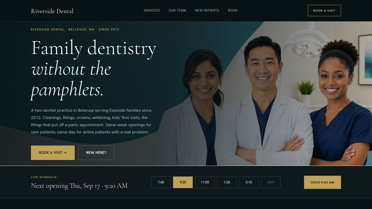
A fictional Bellevue family and cosmetic dentistry practice — Riverside Dental — built to argue that WordPress is the right stack for the health-services request that every patient acquisition CRM tries to monetize. Eleventh demo on the platform and the third of the Tier 1 batch. Live at dental.wp.philiprehberger.com.
The challenge
Dental practices get sold on bundled-with-the-CRM patient-acquisition sites that treat every page as a sales funnel — “GET A FREE WHITENING CONSULT!” banners, no actual cost information, generic stock photos that could be any practice in any city. The wellness-brochure aesthetic produces sites that read identically across thirty competing practices and tell a prospective patient nothing about whether THIS dentist is worth a sixty-minute new-patient visit. The category’s prevailing assumption is that a dental site’s job is lead capture; the patient-side reality is they’re trying to figure out whether the cleaning is going to cost $200 or $2,000.
The narrative confuses “patient shopping for a cleaning” with “patient considering elective veneer work.” For the former — which is most of the work a family practice actually wants — the right site looks more like an honest brochure than a funnel: what the practice does, what it costs, who the dentist is, what insurance the practice takes, what to expect on the first visit. Riverside is the worked example.
The approach
A per-demo theme (dental) on the platform chassis with no new shared block — third time this Tier 1 batch we’ve made that call. The theme owns its identity: clinical teal primary (#0F766E), soft coral accent (#FB7185), warm cream background (#FDFAF2), Plus Jakarta Sans throughout. Same all-sans treatment as roofing but with rounded radius (16px on image cards, 999px on buttons) for the friendly-healthcare register — the dental site needed to feel softer than the trades site without giving up the modern-sans clarity. The header carries the four-item nav plus a permanent “Book a visit” pill, the affordance dental patients actually use; the footer carries practice bio + nav + office hours + contact.
The Tier 1 deferral pattern continues: lawfirm declined to author sfp-blocks/person-card because the attorney card wanted different fields than a dental-team card would; roofing declined to author sfp-blocks/before-after-slider because static side-by-side images with substantive prose did the work better; dental declines person-card again, for the same reason it was right to defer on lawfirm. Three Tier 1 demos in, we’ve seen real variation in what a “team card” should carry — lawyers want bar admissions, dentists want licensure + DEA, coaches want a single bio paragraph and a calendar link. A generic person-card block would either include all those fields as optional (and most would go unused) or be so minimal that every consumer would have to override it. Better to wait for a real client engagement to drive the design.
What’s on the site
- Home. Teal cover hero with practice name + tagline (“Family dentistry without the pamphlets.”), four service cards with rounded-corner thumbnails, a
sfp-blocks/trust-stackresults bar (14 years · 8,200+ patients · 4 providers · 48-hour new-patient window), and a four-up team teaser linking to the full team page - /services/. Four alternating image-text rows for Preventive, Cosmetic, Restorative, and Family & Pediatric care. Each row carries a substantive description and a cost-range paragraph in italics (adult cleaning + exam + bitewings $200–280 out of pocket; veneers $1,400–2,000 per tooth; ceramic crown $1,200–1,500). The cost honesty is the discipline that separates a credible health-services site from a wellness brochure
- /team/. Four lead cards: lead dentist + founder, associate dentist + pediatric lead, lead hygienist, and patient coordinator. Bios written with real-feeling specificity (“opened the practice in 2012 after seven years at a multi-location group practice on the Eastside”) rather than wellness-marketing platitudes
- /new-patients/. What to expect on the first visit, insurance (in-network plans listed by name — Delta Dental, Premera, Regence, Cigna, MetLife, Aetna, United Concordia), payment (HSA/FSA accepted, no-interest in-house plans for treatments over $1,200, no dental-financing pitches at the front desk), records-from-prior-dentist workflow, and an anxious-patient callout that names which dentist handles those cases and how
- /book/. Phone + email columns plus a “things that speed up booking” callout (insurance, prior dentist name, the specific concern). Treats booking as a conversation with Mateo — the patient coordinator the practice has actually named — rather than a form-submit funnel
- Demo banner across the top making it explicit that Riverside Dental is fictional
The stack in detail
_chassisparent theme — templates, parts, patterns, gotcha-busting CSS, filemtime-based stylesheet enqueue. Inherited from the platform via symlinkdentalper-demo theme (this repo) — declaresTemplate: _chassis, ships the teal + coral + creamtheme.json, Plus Jakarta Sans for both heading and body slots, customparts/header.htmlwith permanent “Book a visit” pill +parts/footer.htmlwith practice bio + nav + office hourssfp-blocks/trust-stackon the home page for the results bar. No new block authored, deliberately — the team page uses core/columns + image with rounded thumbnails, the service descriptions use core/columns + image with substantive prose- Four
sfp-*mu-plugins inherited from the platform;dental-banner-config.phpfilters the demo banner copy for healthcare - WordPress 6.x · PHP 8.3 · MySQL 8 on Apache 2.4 (the same EC2 t3.small that hosts every other demo on the hub)
.scripts/seed-pages.sh— idempotent five-page seed. Generates a wide teal-cream hero, four service tiles, four team monogram portraits (DC / DP / AO / MR), and two office-interior shots via ImageMagick. Uploads viawp media importwith the standard<name>-imageattachment-slug rename; creates or refreshes all five pages; pins Home as the front- Standard repo additions:
needed-images.mdin the repo root specifying every image slot the demo expects, and.scripts/capture-portfolio-screenshots.shexposed asnpm run capture:portfoliothat drops the four philiprehberger-nextjs surfacing screenshots into the personal site’s public images directory
Where we made tradeoffs
Deferring the person-card block again. Three Tier 1 demos in, the deferral has stuck. The team page works as core/columns + image + heading + paragraph, and the variation across the three demos (lawyer with bar admissions, dentist with licensure, coach with bio + calendar link) confirms the abstraction would either be too generic to earn its weight or too field-laden to use. Defer until a real client engagement names the actual schema.
Cost-range honesty as the Tier 1 discipline. Same approach we took on lawfirm (dollar figures on representative matters) and roofing (cost ranges for re-roof / gutters / moss). The dental version is more important because health pricing is genuinely confusing for patients and the prevailing dental-site convention is to omit pricing entirely. We put cost ranges in italics under each service ($220–380 for a composite filling, $1,800–2,400 for a single-tooth implant restoration). The site reads as an honest brochure instead of a wellness funnel. A real-client engagement would replace every range with the practice’s actual fees; the structure carries over unchanged.
Book page as conversation, not funnel. Every dental-CRM site ships a “Book Now!” calendar widget that captures patient + insurance + time slot with no friction. We did the opposite: a phone-and-email page that names Mateo the patient coordinator and treats booking as a real conversation. The page does the screening work the calendar widget can’t — insurance verification before the visit, prior-dentist records request, asking the right specific concern. The “more bookings is better” instinct is the trap; a practice that books the wrong patient for the wrong appointment loses an hour and an exam slot. Filtering at the front desk costs nothing and saves both sides time.
Outcomes
- Five-page healthcare practice site live at dental.wp.philiprehberger.com, end-to-end provisioned via the platform’s
provision-demo.shscript - Lighthouse: 98 / 96 / 100 / 92 (perf / a11y / best-practices / SEO) with placeholder photography. Within a point of the platform ceiling without per-demo tuning — the chassis continues to do the work
- Greenfield-to-live in approximately four hours including the per-demo theme, the full five-page seed with cost-range-honest dental content, the case-study writeup, the hub Project registration, and the portfolio surfacing — matches roofing, consistent with the platform compounding
- Third consecutive Tier 1 demo to ship without a new shared block. The deferred person-card and before-after-slider stay queued for promotion in whichever order a real client engagement lands first; the “use core composition” pattern is now the platform’s standard move for service-business demos
- First demo with a permanent CTA pill in the header (
Book a visit) — the affordance the dental-patient genre actually uses. The pattern is being copied forward to coach and give where appropriate - Confirms the per-demo-theme split as the standard pattern across the platform now (eleven for eleven). Identity lives in the demo, primitives live in the platform, neither side has to compromise