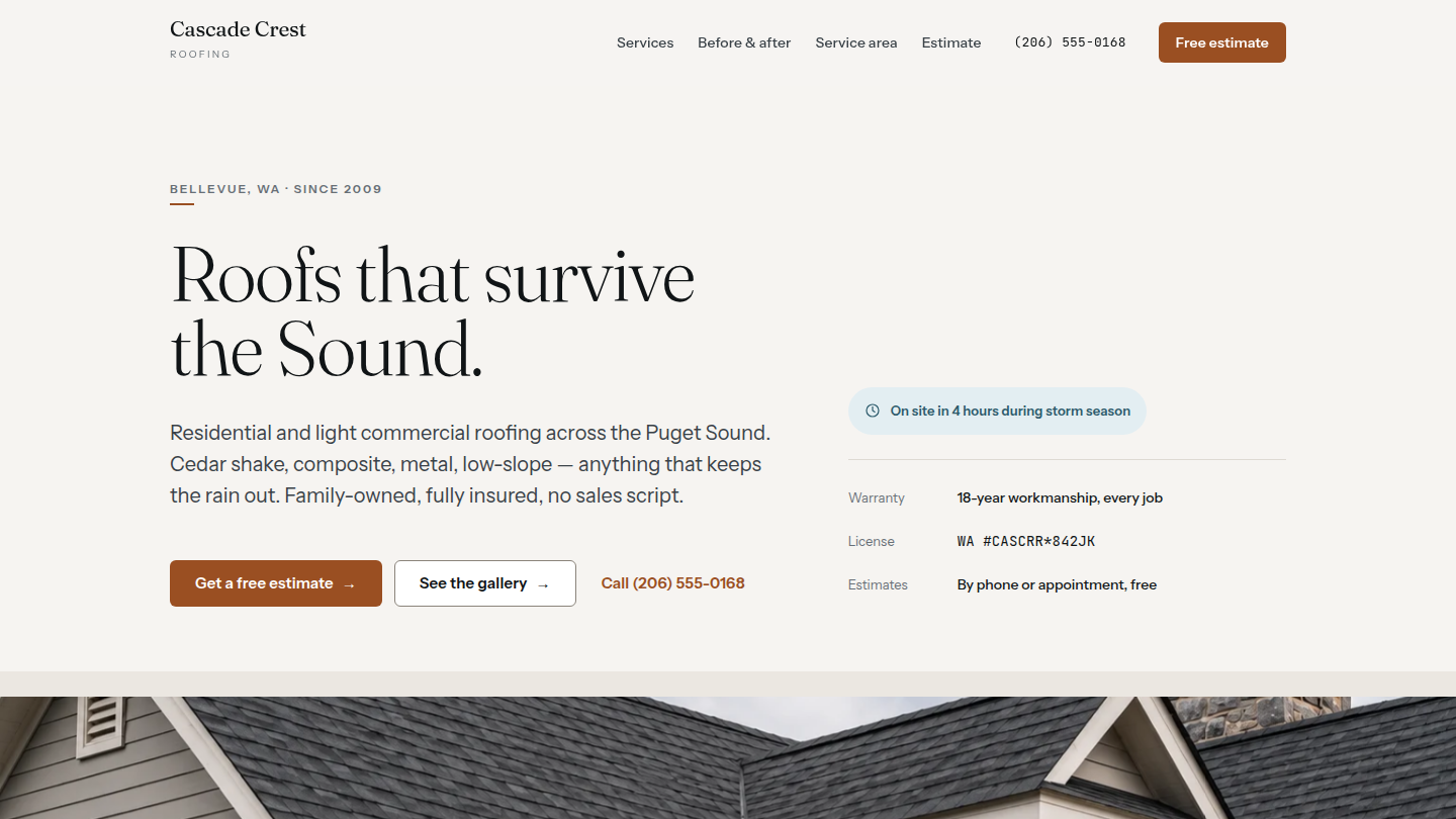
A fictional Puget Sound residential and light commercial roofing contractor — Cascade Crest Roofing — built to argue that WordPress is the right stack for the local-trades request without the bundled-with-the-CRM marketing site every roofing company gets sold. Shipped in 2026 as a five-page trades site, then rebuilt later that year against a full design system. Live at roofing.wp.philiprehberger.com.
The challenge
Local roofing contractors get sold on the bundled marketing site that came with their CRM at $200–400/month, or on a hosted “contractor website” service that ages badly. The market assumption is that trades sites need lead-capture maximizers, “starting at” pricing, and badge-of-the-month trust signals — not a credible technical description of what the company actually does. That assumption produces the worst contractor sites on the web, the ones where every page is some variation of “GET YOUR FREE QUOTE” and the only differentiation between any two firms is the photo of the truck.
The narrative confuses “homeowner shopping for a re-roof” with “homeowner in a panic during a windstorm.” For the former — which is most of the work a roofing company actually wants — the right site looks more like a credible technical brochure than a lead funnel: what the firm does, what the firm refuses to do, the specific materials and procedures, the actual cost ranges for the typical job. Cascade Crest is the worked example.
The approach
The site now implements the Cascade Crest design system, which turns on one idea: quiet page, loud motion. Near-white grounds, one rationed copper accent, hairlines instead of boxes, and an editorial serif at large sizes. Nothing on screen shouts. The drama is entirely in how things arrive and how they answer the cursor — a page that looks restrained in a screenshot and feels alive in a browser.
That is a deliberate inversion of the genre. Trades sites reach for high-visibility color because the work is high-visibility; the argument here is that a homeowner comparing three roofers is reading for competence, and competence reads quiet. The copper is rationed to roughly six marks above the fold — the primary button, link text, the 24px rule under an eyebrow, the slider handle — and the rest of the page is gray, bone and hairline.
Two themes ship, not one. Daylight and Overcast are both designed, both checked, and the accent is not simply darkened for the dark one. Every text pair was verified at 4.5:1 in both.
What’s on the site
- Home. A hero on a full-bleed roof photograph with a word-by-word headline rise and scroll parallax, four service cards with a copper curtain wipe on hover, a dark record strip whose four figures count up once on reveal, a drag-to-reveal before/after gallery, a service-area marquee, three testimonials, and the estimate panel
- /services/. The four services at full size, then how a job actually runs — four visits, and you know the number before the second one
- /before-after/. Three matched pairs, each shot from the same position: cedar shake to composite on Mercer Island, windthrow repair in Ballard, TPO membrane on a Kirkland warehouse
- /service-area/. Twelve neighbourhood chips on a looping marquee that pauses on hover and on focus, and an honest note about why the radius is the radius
- /estimate/. A four-field intake form that works with JavaScript disabled, plus the three things worth knowing before you call
The stack in detail
A per-demo theme (roofing) on the platform chassis, plus fifteen demo-local blocks. The design tokens live in one CSS file — color, space, radius, shadow and the motion scale — and theme.json declares its palette as var() references into that file rather than as hex. That one decision is what makes every WordPress preset theme-aware: a paragraph an editor adds in the block editor follows Daylight and Overcast without anyone doing anything.
Fraunces, Instrument Sans and JetBrains Mono are self-hosted as woff2 rather than pulled from Google Fonts at runtime — 204K across latin and latin-ext, the two variable families as one file each. The mono face appears in exactly two places: the phone number and the license line.
The bespoke sections are blocks rather than patterns, because the brief asked for content editors to change the services, stats, projects and testimonials without touching a template. They are must-use rather than an ordinary plugin: the platform’s weekly content reset would otherwise return them deactivated and every page would render as a wall of block errors. They are also demo-local rather than promoted to the shared library — none of this is generic, and the chassis stays that way.
Every block renders server-side. That keeps one source of truth for the markup and means a future edit cannot invalidate a saved block, which is the usual failure mode of hand-authored static blocks. It also surfaced a WordPress subtlety worth naming: core’s anchor block support is implemented in the JavaScript save() function, so a server-rendered block never receives it. The HTML-anchor field appears in the editor, stores its value, and then does nothing. The shared wrapper helper applies it explicitly.
Motion is vanilla throughout — no library, no jQuery. IntersectionObserver for reveals, requestAnimationFrame for the parallax and the counters, clip-path for the before/after slider, pointer events for drag and the magnetic buttons. Total CSS and JavaScript is 12.8 KB gzipped against a 100 KB budget.
The estimate form posts to admin-post.php as an ordinary HTML form and works with JavaScript off; the client-side validation only saves a round trip. Behind it: a honeypot positioned off-screen rather than hidden, a signed time trap, a per-IP rate limit, and server-side validation that repopulates the form with the reader’s own values on rejection. Submissions are stored as a private post type. There is no SMTP configured on this demo, so a form that claimed to send mail would be lying; mail is attempted only when a notification address is configured and never gates the result.
Where we made tradeoffs
The before/after slider went from deferred to built. The first version of this site declined to build one, on the argument that a static side-by-side pair with substantive prose between them sells a roofing company better than the curtain reveal. That was the right call for a site with no design behind it. With a specification — drag, click, arrow keys, Home and End, a real role="slider" with an aria-valuetext, no transition while dragging and a 240ms ease on release — the reveal earns its place, because the thing it demonstrates is that the two photographs were taken from the same position. It is now the band the page is built around.
Correcting the design system rather than porting its mistake. The token file states that ink-500 is for two specific grounds and names no others. The approved reference page then uses it on a third, where it measures 4.15:1 in the light theme — under the floor, and passing only in dark. Shipping the reference exactly would have shipped an accessibility failure that the design system itself forbids two files earlier. Those roles move to ink-700 on sunken bands: 8.31:1, still clearly subordinate. It is the one place the build knowingly departs from the approved page, and it is why the accessibility score is 100 rather than 96.
The photography is the honest gap. The three before/after pairs are properly overcast and properly matched, and they carry the page. The hero originally shipped was a golden-hour shot made for the previous identity, and the brand book is explicit that the weather is the brand: wide, overcast, no blue-sky stock. It was swapped for the storm-repair frame, which is on-brand but also appears elsewhere on the page. A hero-class photograph shot to this brief is the one thing that would still improve the site, and the case study says so rather than pretending otherwise.
Verification as a committed artefact. The design handoff ends with a definition of done — three widths, both themes, reduced motion, JavaScript disabled, keyboard-only, Lighthouse floors. Checking that by hand once is worth little, because the next change breaks it silently. It is a script in the repo instead: 202 assertions across five pages, three widths and two themes, plus reduced motion, no-JS, keyboard operation of the sliders, the motion set pieces, and an end-to-end submit of the estimate form. npm run verify. Every one of the bugs listed below was found by it rather than by looking.
Outcomes
- Five-page local-trades site live at roofing.wp.philiprehberger.com, in two designed themes
- Lighthouse on the live site: 100 / 100 / 100 / 100 on desktop, and 74 / 100 / 100 / 100 under the platform’s own weekly run, which uses Lighthouse’s default mobile profile — 4× CPU throttling on simulated slow 4G. Accessibility and SEO hold at 100 in both; performance is the number that moves with the conditions, as it always is. Page weight 1.5 MB including six photographs; CSS and JavaScript together are 12.8 KB gzipped
- 202 automated checks covering the handoff’s definition of done, committed and re-runnable against local or production
- Image weight fell from roughly 9 MB to under 1 MB without touching the photographs on disk — WebP sub-sizes, a hero size that is not the original, and a real
sizesattribute so a phone fetches a 768px frame rather than the 1200px one the desktop layout asks for - The first demo on the platform to carry a complete external design system rather than an identity designed alongside the build. The interesting part was not the CSS; it was deciding what to do at the three points where the system contradicted itself, and writing down which way each went
- Four platform-level gotchas came out of it and went into the shared guide, including one — a seed step that printed WordPress’s critical-error banner after succeeding — that turned out to affect eight other demos